
Global Climate Change and Human Causes
Ralph J. Cicerone
National Academy of Sciences
INTRODUCTION
Global climate change is a much discussed topic at the present time. This paper starts with a brief discussion about Earth’s climate and its energy budget from a planetary perspective. It then addresses the greenhouse effect caused by certain greenhouse gases. Current data on recent climate change are summarized, and the subject of carbon dioxide from fossil-fuel burning is discussed. Human causes, what we need to do about the situation, and first steps towards solutions are then considered. Throughout, the contributions of the space program to the study of global climate change and the mitigation of its effects will be addressed.
Earth’s Climate and Energy Budget
Figure 2.1 depicts the Sun shining down on Earth. The number 342 indicates the amount of power the planet receives—342 watts per square meter averaged over the planetary surface day and night and annually. About one third of this power is directly reflected back to space from white surfaces such as the tops of clouds and the snow surfaces at the poles. (Black surfaces and dark surfaces absorb, light surfaces reflect.) On balance then, 237 of the 342 watts per square meter are being absorbed in the form of visible sunlight (plus a tiny amount of ultraviolet sunlight and a little bit of infrared).
On a short time scale, say one year, the planet is not heating up, nor is it getting very cold. We are roughly in an energy balance, a fact that has been borne out by measurements from space platforms.
The problem is we are “roughly” in balance, not exactly in balance. We are warming up due to certain gases in the atmosphere that interfere with the balancing that would be caused by planetary radiation. The lower layers of Earth’s atmosphere are heating up, while the amount that continues to escape is almost in balance with what is coming in.
The Greenhouse Effect
Is the greenhouse effect real or merely an unproven idea? There is a lot of evidence to show that it is real and is operating.
For example, we are able to calculate the temperature of the surface of Mars. We could calculate it before it was actually measured by spacecraft. It is about 30°C below zero, varying a little during the day and night cycle. We could calculate the number correctly because there is no greenhouse effect on Mars. The atmosphere is too thin. The way we do such a calculation is to multiply the incoming sunlight (which at Earth-orbit distance is 342 watts per square meter as mentioned earlier) by 1 minus the reflectivity of the planet. If the planet were reflecting 100 percent of the incoming light, that would be zero; however, Mars only reflects about 30 percent. If you assume that nothing is changing with time, this is the equation you have to solve,
NOTE: Transcribed from a lecture presented at the University of New Hampshire, October 19, 2007.
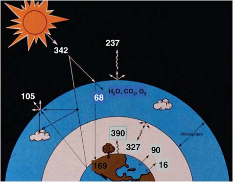
FIGURE 2.1 Earth’s energy balance. SOURCE: Reprinted with permission from V. Ramanathan, B.R. Barkstrom, and E.F. Harrison, Climate and the Earth’s radiation budget, Physics Today 42(5):22–33, 1989, with modifications. Copyright 1989, American Institute of Physics.
which should provide the effective temperature of the planet. We get the right number for Mars.
However, if we try the same calculation for Earth, it does not work. We would calculate that Earth’s surface is a subfreezing 18°C below zero on average and should be frozen into a solid block of ice. As far as we know, that has never been true throughout geologic history, let alone being correct now. The reason it is wrong is that we have neglected the ability of the gases—notably water vapor, carbon dioxide, ozone, and a few others—to assist in heating the surface of the planet. There is a level in our atmosphere at which the temperature is exactly −18°C, but not at the surface. That is because of the greenhouse effect.
If we do the same calculation for Venus, we get a really incorrect answer. We underestimate the temperature of Venus by several hundred degrees. That is because the Venus atmosphere, as we have learned from the space program, is very thick, very heavy, has a much higher pressure than Earth’s, and is composed largely of carbon dioxide. Some people attribute the Venus situation as being due to a runaway greenhouse effect. Venus is not that different in distance from the Sun than Earth, but its temperature is grossly different, around 540°C.
This is powerful evidence that the greenhouse effect is natural, real, and was operating before humans were even here.
Beginning in the fall of 1957, David Keeling started measuring carbon dioxide in the air on the flanks of the Mauna Loa volcano on the big island of Hawaii roughly once an hour, and he averaged the data every month. Keeling died about 3 years ago, but this recording (Figure 2.2) is being carried on by hundreds of other people around the world. Each one of the black dots in Figure 2.2 is the average of a month’s data.
The average carbon dioxide amount started out around 312 parts per million (ppm), and by 2005 it was about 380 ppm. The most important thing that the graph shows is that carbon dioxide in the atmosphere continues to increase rather smoothly. Superimposed on the long-term trend are the annual cycles, almost like a sine wave.
In either hemisphere, in the spring or summer the carbon dioxide amounts are lower. In the fall and winter, they go up. The next spring and summer they come down a little bit, and again in the fall and winter, they go up. In the spring and summer photosynthesis is drawing carbon dioxide out of the air, and in the fall and winter the decay of annual plants, the decay of organic matter in soils, and root respiration exude carbon dioxide back into the atmosphere. In fact, the peak-to-peak amplitude of the depth of this oscillation tells us something about the total amount of photosynthetic activity on the planet. This is where our oxygen comes from. There is a lot of geochemical and
bio-geochemical information contained in this graph. Many other scientists have been making such measurements for many years, using many different techniques. The numbers are right. They have been tested many times before.
Carbon dioxide is a strong greenhouse gas. In fact, we think it and water vapor are responsible for keeping Earth’s temperature above the subfreezing temperature mentioned above.
For the last 20 years, scientists have been extracting ice cores in Antarctica and Greenland, and by counting layers and by other identifying information, they have created an historical record extending back 600,000 years.
The particular record in Figure 2.3 goes back more than 400,000 years. Today is time zero, and time goes back to the left. The lower curve is an approximation of what the temperature was like in the region where the snow and ice formed, obtained from isotopes of water, hydrogen, and oxygen.
Glaciated periods can be seen in the past. The most recent glacial period, when there was a great deal of ice over the northern hemisphere, was about 20,000 years ago. The previous one was about 140,000 or 150,000 years ago. The temperature was low. In between those glaciated periods, there are periods of interglacial warming. We are in such a period now.
On the upper curve is a carbon dioxide record. The ice cores that have been dated can be interrogated as to what the gases are inside, either by crushing the ice and extracting the gas under vacuum, or by melting it, which does not work quite as well if the gas is water-soluble. When the temperature was low in the previous ice age, carbon dioxide amounts were very low: on this scale, about 180 ppm.
From Dave Keeling’s curve (Figure 2.2) we are now around 380 ppm. In the long ice-core record going back over four planetary ice ages, we see that carbon dioxide was around 180 ppm during each of the cold times, and during the warm times over the last four glacial cycles it was 280 ppm, 260 ppm, and 280 ppm—never 380 ppm.
Whatever is happening, Earth is now being pushed into a regime where it has not been before at any time
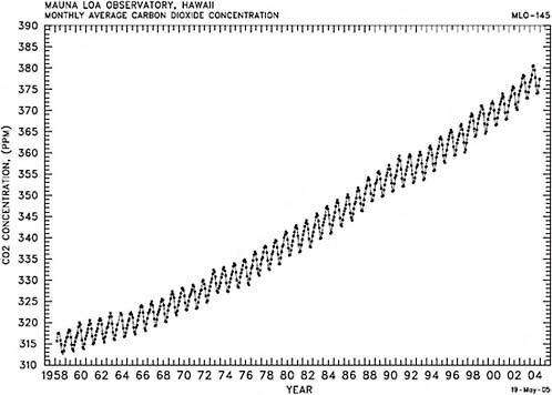
FIGURE 2.2 Atmospheric CO2 concentrations (ppmv), 1958–2004, derived from in situ air samples collected at Mauna Loa Observatory, Hawaii. SOURCE: Courtesy of C.D. Keeling, T.P. Whorf, and the Carbon Dioxide Research Group at the Scripps Institution of Oceanography, University of California, La Jolla.
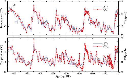
FIGURE 2.3 Antarctic ice core records. Temperature CO2 (upper) and CH4 (lower) time series (thousands of years before present) from the Vostok Antarctic ice core. SOURCE: J. Hansen and M. Sato, Greenhouse gas growth rates. Proceedings of the National Academy of Sciences 101(46):16109–16114, 2004. Copyright 2004 National Academy of Sciences, U.S.A. Original data from J.R. Petit, J. Jouzel, D. Raynald, N.I. Barkov, V.-M. Barnola, I. Basile, M. Bender, J. Chappellaz, M. Davisk, G. Delaygue, M. Delmotte, et al., Climate and atmospheric history of the past 420,000 years from the Vostok ice core, Antarctica, Nature 399: 429 436, 1999.
where we have direct measurements. There is certainly evidence that hundreds of millions of years ago Earth was warmer, and we infer that there was a lot of carbon dioxide. There is really no direct evidence of this, although some people think there is indirect evidence.
In the case of methane, which is another very important greenhouse gas, partly natural, it is the same story. When the temperature was low in the ice ages, methane was at one-third parts per million. When it was warm, methane was at two-thirds parts per million. One third, two thirds, one third, two thirds, and so forth. Methane amounts are now five times higher than they were in low times, or about two and a half times higher than they were in the highest times geologically. There is real evidence that these greenhouse gases have now entered into a realm of concentration where they have not been for the last half million years.
Figure 2.4 shows the same modern record (Keeling curve) shown in Figure 2.2 superimposed on the geologic history. On the time scale shown, that is the way carbon dioxide is behaving.
So where is the carbon dioxide coming from? Can we really be sure that the increase of carbon dioxide in the global atmosphere is due to fossil fuel burning? We can, but we have to look at a lot of evidence, for example, the actual amounts.
If you look in Figure 2.5 at the amount of carbon dioxide that is being discharged by fossil-fuel burning, plus a little bit generated during cement production, you can see that it has been growing very rapidly, such that 100 years ago we were only discharging about 120th as much carbon dioxide, because we were not really using as much oil, petroleum, and so forth. Figure 2.5 shows the current amount of carbon dioxide lost into the air from fossil-fuel burning to be about 7 billion (7,000 million) metric tons (as carbon, including
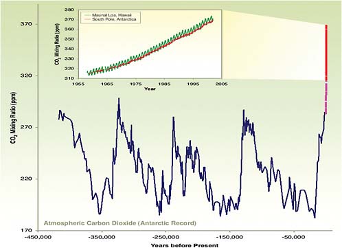
FIGURE 2.4 Atmospheric CO2 concentrations (Keeling curve) superimposed on the geologic history. Atmospheric Carbon Dioxide (Antarctic Record) Years before Present. SOURCE: Reprinted by permission from Macmillan Publishers Ltd: Nature (J.R. Petit, J. Jouzel, D. Raynaud, N. I. Barkov, J. M. Barnola, I. Basile, M. Bender, J. Chappelaz, M. Davis, G. Delaygue, M Delmootte, V. M. Kotlyakov, M. Legrand, V. Y. Lipenkov, C. Lorius, L. Pepin, C. Ritz, E. Saltzman, and M. Stievenard, Climate and atmospheric history of the past 420,000 years from the Vostok ice core, Antarctica, Nature 399, 429–436, 1999) Copyright 1999). Inset from C.D. Keeling and T.P. Whorf, Atmospheric carbon dioxide record from Mauna Loa (1957–2004), 2005, available at http://cdiac.ornl.gov/trends/co2/graphics/mlo145e_thrudc04.pdf, and earlier Keeling and Whorf CDIAC data sets.
that due to the flaring of natural gas; the red curve). Some of it is due to the direct burning of natural gas, some of it is due to the burning of petroleum, and some of it is due to the burning of coal and wood.
These numbers add up. In fact the amount of carbon dioxide that we measure increasing in the air every year is about 60 percent of this amount, rather than 100 percent. Several other things are going on. Carbon dioxide is being taken up by oceans and by plant growth. Also, there is some carbon dioxide entering the air due to the decay of the biological material in an imbalanced way, the tropical deforestation, for example. It is not just the burning of the plant material and wood that releases carbon dioxide—it is the loss of soil or organic matter when those tropical soils are exposed and are no longer controlled by the roots.
Figure 2.6 shows carbon dioxide emissions from energy consumption in the United States, broken down by source. The United States alone releases 6 to 7 billion tons of carbon dioxide a year. About 2.6 billion tons comes from the burning of petroleum, about 1.2 billion tons from the burning of natural gas, and a little over 2 billion tons from the burning of coal. On this scale, if you look at the contributions to carbon dioxide emission from other sources like hydroelectric plants, biomass, geothermal plants, and so on, they are virtu-
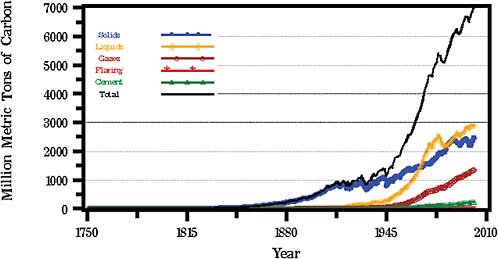
FIGURE 2.5 Global CO2 emissions from fossil fuel burning, cement production, and gas flaring for 1751–2002. SOURCE: Data from the Carbon Dioxide Information Analysis Center, U.S. Department of Energy, Oak Ridge National Laboratory.
ally zero. It is primarily the fossil fuels that release the carbon dioxide in the very active burning from which we derive the energy, due to exothermic chemical reactions. It is inherent in the process of extracting energy. Figure 2.7 shows U.S. carbon dioxide emissions from energy consumption by usage instead of source.
When you go through all the numbers, compare atmospheric measurements, and use other lines of evidence like the isotopic content of the carbon and fossil fuels compared to the isotopic content of the carbon dioxide, the spatial patterns, the geographical patterns, the seasonal behavior, and so forth, you have very compelling evidence that the carbon dioxide increase that we are seeing is caused by humans.
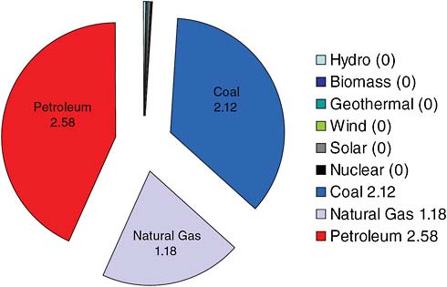
FIGURE 2.6 U.S. carbon dioxide emissions from energy consumption by source (in billion metric tons CO2). SOURCE: Data courtesy of the University of California, Lawrence Livermore National Laboratory and the Department of Energy.
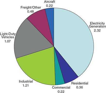
FIGURE 2.7 U.S. carbon dioxide emissions from energy consumption by usage (in billion metric tons CO2) SOURCE: Data courtesy of the University of California, Lawrence Livermore National Laboratory and the Department of Energy.
Similarly with methane. In Figure 2.8 the red part of the pie chart represents annual methane release rates that are due to human activities. Some of them are under human control, some of them are inadvertent. The yellow part of the pie chart shows natural sources of methane.
There are some new entries here, but frankly the changes have not made much of a difference. The best known number here is rather euphemistically called “enteric fermentation.” That is basically belching and flatulence of cows. You might think that this is a wild guess, but in fact it is the most well-known number on the chart because a typical cow loses about 10 percent of its daily caloric intake every day due to methane loss.
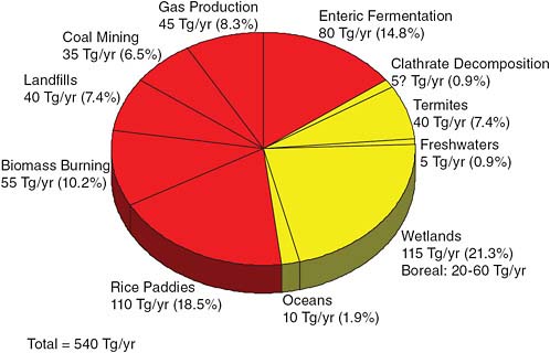
FIGURE 2.8 Global methane release rates. SOURCE: R. Cicerone and R.S. Oremland, Biogeochemical aspects of atmospheric methane, Global Biogeochemical Cycles 2:299–328, 1988. Copyright 1988 American Geophysical Union.
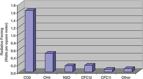
FIGURE 2.9 Radiative forcing from well-mixed greenhouse gases, 2004. SOURCE: Data from NOAA ESRL Global Monitoring Division.
People have known this for 100 to 125 years, and they have tried to stop it by changing the cow’s diet. It turns out that the poorer the diet is, the higher the loss as methane. Sheep are similar.
So what does it all mean? As noted, we receive a net of 237 watts per square meter of sunlight. What is the effect of greenhouse gases in trapping energy near Earth’s surface? It turns out to be one percent.
As shown in Figure 2.9, the added carbon dioxide measured in the last 60 to 80 years is contributing about 1.6 watts per square meter of extra energy trapped in Earth’s planetary boundary layer down at aircraft altitudes and below. Methane contributes about 0.5 and nitrous oxide and a whole slew of other greenhouse gases add up to a little bit more than one percent of the solar constant. The output of a star like our Sun does change over its lifetime, but not as much as one percent per century. There is no theory or observations that suggest that the output of the Sun could change one percent in a hundred years. There are people who wish it were so, and 10 or 15 years ago we thought that maybe the climate changes we were beginning to see could be blamed on the Sun, but there is evidence that refutes this assumption.
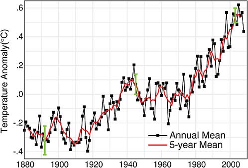
FIGURE 2.10 Global temperature: Landocean index from NASA Goddard Institute for Space Studies. SOURCE: Updated from J. Hansen, Mki. Sato, R. Ruedy, K. Lo, D.W. Lea, and M. Medina-Elizade, Global temperature change, Proceedings of the National Academy of Sciences 103:14288–14293, doi:10.1073/pnas.0606291103, 2006. Copyright 2006 National Academy of Sciences, U.S.A.
The Warming of the Planet
So what is happening now? Since 1980, NASA has been gathering temperature measurements (several hundred million) from around the world going back to 1880.
In Figure 2.10 from the NASA Goddard Institute for Space Studies, zero is not zero degrees, it is a reference point—the average temperature all over the world from 1951 to 1980. Compared to that average, the period of 70 years before 1951 was mostly colder, except around 1940, and everything since has been warmer.
In Figure 2.11 temperatures are measured over land and sea, averaged according to the size of the latitude belt, and presented as a global average. The urban-heat-island effect is removed. Many of the places where we have been measuring temperatures have been surrounded by cities as time has developed. Blacktop and human energy usage is making our cities hotter than the surrounding regions. What is interesting is that now the temperature increase is seen almost everywhere, although it is not uniform. In Figure 2.11 the lower boundary is the South Pole and the upper boundary the North Pole.
Note that you can see the outlines of continents in the heat pattern. The warming on this false-color scale is largest in the high-latitude continental regions like upper Siberia and the Arctic region. The warming there is really pronounced compared to everywhere else, except down in the high southern latitudes. Over some of the open ocean regions, there is a very small, or zero, temperature increase because of the heat capacity of water. What suggests that this phenomena is not natural is that warming is taking place everywhere at the same time.
Historically, when we have temperature records such as the Medieval warm period, or a mini ice age, we have records from different places on Earth that are contradictory, or nonexistent, because when it is cold in one place, it is hot in another. In fact that is even true today in the United States on a single day. What is happening now, though, is that the warming is taking place everywhere at once.
The Rise in Sea Level
Another noted phenomenon is the rise in sea level. For about 100 years, people have been measuring sea level rise carefully, but in a very primitive way—basically, pounding stakes into the shoreline and recording mean sea level at many locations around the world. Figure 2.12 has been constructed over the last 100 years and shows sea level rise averaged over the ocean basins of about 1.5 millimeters a year, which is about 15 centimeters, or 6 inches, a century.
Not all the ocean basins have behaved the same way, because there is geological heaving and rising going on at the same time that has nothing to do with water-related sea level rise. The right-hand part of Figure 2.12 shows a red curve which is a new set of data
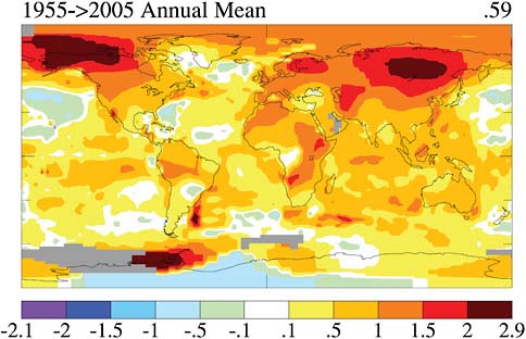
FIGURE 2.11 Last 50 years surface temperature change based on linear trends (degree C) SOURCE: J. Hansen, R. Ruedy, M. Sato, and K. Lo, NASA Goddard Institute for Space Studies, and Columbia University Earth Institute, New York, N.Y.

FIGURE 2.12 Recent sea level rise (1882–2005) based on Permanent Service for Mean Sea Level (PSMSL) tide gauge data from 23 sites selected by Douglas (1997). SOURCE: Created by Robert A. Rohde, University of California, Berkeley. Courtesy of Global Warming Art, available at http://www.globalwarmingart.com/wiki/File:Recent_Sea_Level_Rise_png.
collected by satellite-born altimeters on two spacecraft, TOPEX and Jason, looking down at Earth. Figure 2.13 is the detailed record of what the satellite data show.
Satellite measurements are probably more accurate and are global, with proper averaging over all the ocean basins. They show a rate of sea level rise double that which had been measured earlier—3 millimeters per year rather than 1.5. No one is sure yet whether this represents an acceleration of the rise of sea level over the last 15 years, or whether it is just a more accurate determination of a trend that was underway. Sea level is rising globally—that is for sure.
Ice Cover
Figure 2.14 is a visual representation of the change in Northern Hemisphere sea ice between 1979 and 2003. It is evident that the ice cover in the Arctic region has been reduced. Such measurements are now being made from space.
One example of such a space-based data collection activity is the Gravity Recovery and Climate Experiment (GRACE) mission (Figure 2.15) involving two satellites that very accurately measure the distance between each other using a K-band interferometry, as shown in Figure 2.15. They also make use of Global Positioning System signals for accurate position location. If there is any minor perturbation to Earth’s gravitational field due to a “mass anomaly,” such as a large mountain or a big piece of ice, the leading satellite feels the gravitational anomaly sooner and starts to separate in distance a little bit from the trailing one. By carefully measuring the variations in distance between the two satellites and when they occur, over a period of months it is possible to infer changes in the mass of the ice. In the case of Greenland, after taking measurements for several years, it was possible to put together Figure 2.16 showing the ice mass loss.
These results in Figure 2.16 compare very well
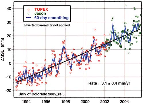
FIGURE 2.13 1992–2006 sea level rise observed by satellite altimetry SOURCE: Eric Leuliette, University of Colorado, Boulder available at http://sealevel.colorado.edu; updated from Leuliette, E. W, R.S. Nerem, and G. T. Mitchum, 2004, Calibration of TOPEX/Poseidon and Jason altimeter data to construct a continuous record of mean sea level change, Marine Geodesy 27(1-2):79–94.
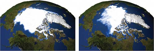
FIGURE 2.14 Northern Hemisphere sea ice extent (1979 versus 2003) Left: Sea ice minimum extent for 1979. Right: Sea ice minimum extent for 2003. SOURCE: NASA Goddard Space Flight Center Scientific Visualization Studio.
with those generated by other satellite missions using different measurement techniques. One such technique involves a radar altimeter looking down at the ice, which enables the mapping of the height of the ice. By mapping the height of the ice and the way it is shrinking in height, you can calculate how much ice mass has been lost. When compared to what is measured by the GRACE mission, you get roughly the same number. A big ice-mass loss is taking place. Unfortunately the satellite record is only 3 or 4 years long at this point. Similar results have been noted over Antarctica, but not in all parts.
Throughout the Cold War, the United States and Russia (the former Soviet Union) were operat-
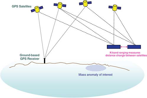
FIGURE 2.15 GRACE mission concept. SOURCE: Courtesy of NASA.
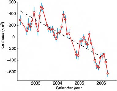
FIGURE 2.16 Greenland Grace monthly mass solutions. SOURCE: Reprinted by permission from Macmillan Publishers Ltd: Nature (I. Velicogna and J. Wahr, Acceleration of Greenland ice mass loss in spring 2004, Nature 443:329–331), Copyright 2006.
ing nuclear-powered submarines under the ice caps throughout the Arctic. It was very much in their interest to measure how thick the ice was above their heads if they ever had to surface. A lot of these data have now been declassified. They show that the thickness of the sea ice over the Arctic has decreased roughly 40 percent in the last 40 years.
Referring now to Figure 2.10, there is something unusual about the last 30 years. The warming is now being observed everywhere. It is really difficult to find any temperature station in the last 30 years that is showing anything other than warming. Furthermore, the rate of change is faster than anything that has been measured before. It is also beyond the rate of variability that can be generated in a first principles fluid dynamical model of Earth’s oceans and atmosphere.
Another distinction about the last 30 years is that it is the first period in human history in which it has been possible to measure the output of the Sun with enough precision to be able to say whether the Sun is getting warmer, giving us more heat or less.
Figure 2.17 is a graph by Claus Frohlich and Judith Lean. They have merged measurements of the output of the Sun made by three different satellites over a 22-year period. The output is changing, up and down, by a tenth of a percent, roughly like a solar cycle. It is not trending upward.

FIGURE 2.17 Recent analyses of satellite measurements do not indicate a long-term trend in solar irradiance (the amount of energy received by the Sun). SOURCE: Courtesy of Physikalisch-Meteorologisches Observatorium Davos—World Radiation Center (http://www.pmodwrc.ch), updated from C. Fröhlich, Solar irradiance variability since 1978: Revision of the PMOD composite during solar cycle 21, Space Science Reviews 125(1-4):53–65, 2006.
It was not that many years ago that people were theorizing that climatic changes that we were seeing were due to the Sun. It is not possible to do that anymore. We now have measurements that show that is not the case. The evidence is very strong that what we are seeing is a human effect.
Figure 2.18 displays the result of a set of cal-
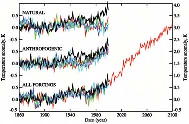
FIGURE 2.18 Computed and observed temperatures. SOURCE: P.A. Stott, S.F.B. Tett, G.S. Jones, M.R. Allen, J.F.B. Mitchell, and G.J. Jenkins, External control of 20th century temperature by natural and anthropogenic forcings, Science 290(5499):2133–2137, doi:10.1126/science.290.5499.2133, 2000. Reprinted with permission from AAAS.
culations done 5 or 6 years ago by Peter Stott and colleagues, where they tried to assimilate data into a global average temperature record. Globally averaged temperature is not the most important indicator of climate variability, but it is the easiest to measure and understand and the easiest to calculate.
If you look at either natural or human activity (“anthropogenic”) separately, the calculations do not represent what actually has been happening, but if you look at the two together (“all forcings”) you get a pretty good simulation of what has been measured. As the calculations in Figure 2.18 project into the future, based mostly on fossil-fuel energy usage, they indicate a continued global warming. This is why people are getting seriously concerned about the melting and breaking of ice formations over Antarctica and Greenland. When ice formations on land melt, the water goes into the ocean, adding to sea level rise.
One other kind of evidence of ice changes has to do with seismic activity and cracks inside the ice, which is being recorded by seismic instruments. The level of that activity has multiplied in the last 5 years.
What Do We Do? Where Is It All Coming From? What Is Going to Happen?
Figure 2.19 comes from the Energy Information Agency, which has compiled data of total world-marketed energy consumption, by types of economy
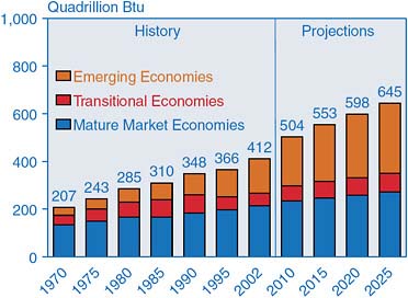
FIGURE 2.19 World marketed energy consumption by region, 1970–2025. SOURCE: Courtesy of Energy Information Administration, U.S. Department of Energy.
from 1970 to today, and then projected into the future. Currently we are at about 412 quadrillion Btu. That number has virtually doubled in 35 years—from 207 to 412 Btu (35 years at a 2 percent per year growth rate). Projecting ahead to the next 20 years, there is another 50-percent increase. This is thought to be a rather conservative projection. (Probably 80 or 85 percent of the carbon dioxide build up in the atmosphere is due to fossil fuel usage. Fifteen to twenty percent is due to tropical deforestation and loss of organic matter from soil.)
Another interesting feature, aside from raw growth in demand, is where the growth is occurring. The dark blue part of the histogram in Figure 2.19 is from mature market economies like the United States, Western Europe, and Japan. The red part is from so called “transition economies.” These are a little bit harder to define. The brown part accounts for emerging economies like China and India and a few other places in Asia. This is where the significant growth has come from in the last 10 years.
It can be seen immediately that if we are going to try to solve this problem, either with technology or moderating demand and improving efficiency, we have a double challenge on our hands. We have to deal with what is happening currently and also with aspirations for economic development, which is strongly linked to energy use in the emerging economies. This is one of the reasons why it has been difficult to obtain an international agreement on what to do.
What do we need to do? Most people would say we need a dual strategy. We have to maximize energy efficiency and minimize energy use. We have to develop new sources of clean energy—where “clean” means not just lower carbon dioxide emission, but lower emissions of mercury, sulfur, and black carbon and soot (the things that are making cities in developing countries so unhealthy). This is the challenge.
There is some good news; in fact, there is a lot of good news. Figure 2.20 shows the electricity consumption per person in the United States and in California.
California’s electricity use per person has flattened out over the last 30 years, while in the rest of the United States it has continued to go up. This has happened for several reasons. First, California instituted statewide regulations on insulation in appliances and homes
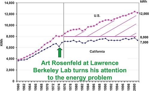
FIGURE 2.20 Electricity consumption/person in the U.S. and California. SOURCE: Adapted from Commissioner Art Rosenfeld, “Sustainable Development, Step 1: Reduce Worldwide Energy Intensity by 2% Per Year,” presentation at the Global Energy International Prize Presentation and Symposium, University of California at Berkeley, November 19, 2003. Courtesy California Energy Commission.
and made it easier to buy energy-efficient appliances. Second, California adopted a pricing strategy whereby you pay more for electricity if it is used at peak demand hours and less if you use it during off-peak hours. That saved a lot of money in terms of transmission lines—power plants that did not have to be built, and so on. California also de-coupled the profits of utilities from the amount they were selling. Some of this was done through legal intervention and some through regulation.
During a congressional hearing last year where this author testified, the question was asked, “What’s the big deal about 2 degrees temperature change?” Another witness said, “I can not even feel it. I can not tell the difference between 72 degrees and 74.” By way of response, it is worth referring to Figure 2.21, which is based on data from the California Energy Commission for the summer of 2004. If the data are broken down into the number of days in the summer when the temperature was 75°F, 80°F, 85°F, and so on, and the total electricity use for each temperature is plotted, the result is a straight line. Every 2 degrees increase in summer daytime temperature costs 1.2 Gigawatts of electricity! Carrying out the same exercise in other states, you get basically the same graph with more scatter.
No matter how you look at it, these changes are already happening, and in the future are going to be significant. One way to rate the changes in importance is whether or not they are reversible.
Back in the 1950s, 1960s, and 1970s, the biggest use of electricity in the home was the refrigerator. If you assume that there was basically one refrigerator in every house, Figure 2.22 shows the way household refrigerator electricity consumption was going. In that period refrigerators were getting bigger. Then California instituted some standards on efficiency of appliances and forced the manufacturers to start building better refrigerators, and the refrigerator electricity consumption in California started going down. At the same time, the refrigerators were still getting bigger. In fact, what limits the size of a household refrigerator today is the width of the kitchen door!
But there is a mysterious “vampire” that has come into the situation. The lower curve in Figure 2.22 shows the typical usage in a California household of “vampire electricity”—the electricity needed to operate
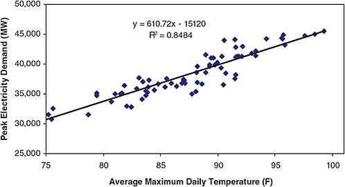
FIGURE 2.21 Peak electricity demand in the CallSO area as a function of maximum daily temperature: June–September 2004. NOTE: CalISO = California Independent System Operator, a not-for-profit public-benefit corporation charged with operating the majority of California’s high voltage power grid. SOURCE: California Climate Change Center, Climate Change and Electricity Demand in California, White Paper CEC-500-2005-201-SF, February 2006. Courtesy California Energy Commission.
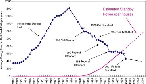
FIGURE 2.22 United States refrigerator use (actual) and estimated household standby use v. time. SOURCE: Commissioner Art Rosenfeld, “Sustainable Development, Step 1: Reduce Worldwide Energy Intensity by 2% Per Year,” presentation at the Global Energy International Prize Presentation and Symposium, University of California at Berkeley, November 19, 2003. Courtesy California Energy Commission.
appliances (TVs, computers, video recorders, and so on) in the stand-by mode. We have got to do something about the way many of these electronic appliances are designed, because they have now surpassed what used to be the biggest consumer of electricity in a typical household! We can do this. It is not that difficult.
What else can we do? Energy efficiency has to be the first step. Even if you do not think that climate change is serious, or you did not want to bet that climate change is going to be serious, you would still have good reasons to do this because of all the things that energy efficiency would do.
First of all, it could decrease U.S. dependency on foreign oil. Just driving our cars and trucks in the United States today, we are using 6 million barrels of oil per day more than we are producing. At $50 a barrel, this accounts for about $200 billion of our trade deficit. This trade deficit means that we are dependent for the operation of our country’s entire economy on parts of the world that do not particularly like us. We should clearly decrease our dependency and thus improve our national security. We could decrease local air pollution and increase our national competitiveness. (On average, manufacturing in Germany and Japan currently uses about 60 percent as much energy per unit produced as we do. At times of high-energy prices, that cost of manufacturing is a significant part of the cost of unit production.) We could encourage the development of new products for global markets.
Americans are supposed to be the innovators. We are supposed to know how to create whole new industries. We could be grabbing these markets and helping the world at the same time, if we would only get serious about energy efficiency and create a whole new generation of energy-efficient products. All this, while also slowing down the increases of carbon dioxide and methane in the atmosphere. Energy efficiency seems to be a no-brainer.
There are lots of other things we can be doing. However, it is going to take a combination of citizen action, governmental action, and business leadership.


