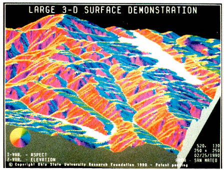
Plate 1.
Three-dimensional map of the San Mateo area of California near the San Andreas fault. The lake in the background lies on the fault. The map uses 128 colors to enhance perception of relief and was generated by using the patented (U.S. Patents 5,067,098 and 5,283,858) MKS-ASPECT™ process described by Moellering and Kimerling (1990). Copyright 1990 by the Ohio State University Research Foundation.
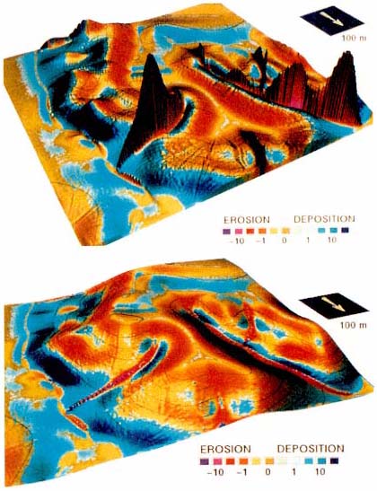
Plate 2.
Top: Visual representation of a mathematical model of topographic potential for erosion and deposition of a terrain. Color represents the transport capacity of the surface showing its directional derivative (topographic potential for erosion and deposition). Potential for erosion is high where sediment transport capacity increases (red areas). Potential for deposition is high where transport capacity decreases (blue areas). Bottom: Three-dimensional view of an actual terrain that has been smoothed and vertically exaggerated. Colors represent the potential for erosion and deposition. The two images together allow evaluation of the relationship between the shape of the terrain and the results of the erosion/deposition model.
Source: Mitasova et al. (1996).
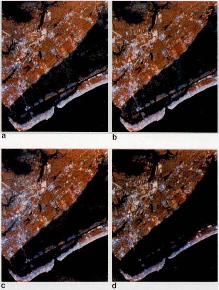
Plate 3.
Projected effects of a sea-level rise on a coastal region near Charleston, South Carolina, based on a combination of Landsat Thematic Mapper (TM) data, digital files of elevation and bathymetry, and data on land cover. The figure shows year 2100 sea-level rise scenarios for (a) a baseline estimate of a 28-cm rise above present mean sea level (MSL); (b) a low-end estimate of a 3-cm rise above present MSL; (c) a best estimate of a 46-cm rise above present MSL; and (d) a high-end estimate of a 124-cm rise above present MSL. Inundation is shown by dark shading. The low-lying populated areas would be inundated under high-end estimate conditions.
Source: Jensen et al. (1993b).
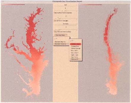
Plate 6.
The left panel of the interface shows the dissolved inorganic nitrogen (DIN) surface interpolated from values at 49 sample points in the Chesapeake Bay (dark red represents high DIN concentrations). The right panel depicts the same data filtered according to the reliability of estimates generated by spatial interpolation. Grid cells for which the value is highly reliable are completely filled. As cell estimates become less certain, the proportion of the cell filled with a shade of red decreases to the point at which the DIN level of highly unreliable cells cannot be interpreted at all.
Source: MacEachren et al. (1993).
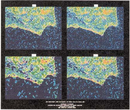
Plate 7.
Four "realizations" of vegetation distribution in the Santa Barbara, California, area. Each represents a classification of grid cell by grid cell (i.e., pixel by pixel) reflectance signals received by a satellite sensor (the Thematic Mapper). Each view is a possible interpretation of what the Thematic Mapper has measured for each cell. The difference among the possibilities results from manipulation of a weighting parameter that adjusts the extent to which each pixel's immediate neighbors are taken into account in assigning a pixel to a vegetation class. High spatial weighting produces more homogeneous regions with few isolated pixels (by assigning pixels whose reflectance puts them near a class boundary into the class most similar to that of their neighbors).
Source: Goodchild et al. (1994, Plate 20).

Plate 8.
Computer simulations showing the effects of climate change resulting from a doubling of atmospheric carbon dioxide on national grain (wheat, rice, coarse grains, and protein feeds) yields. The colors show the changes (with respect to the present) in grain yields under climate changes predicted by three general circulation models: GISS, Goddard Institute for Space Studies model; GFDL, Geophysical Fluid Dynamics Laboratory model; UKMO, United Kingdom Meteorological Office model. The left column isolates the effects of climate change on grain yields. The right column shows the combined effects of climate change and doubled of carbon dioxide levels on grain yields.
Source: Rosenzweig et al. (1995).
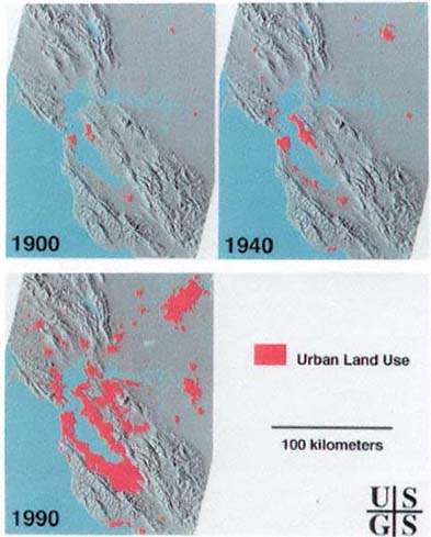
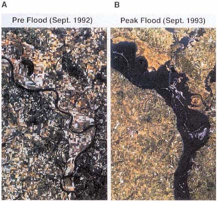
Plate 10.
Satellite images of the lower Mississippi River Valley near Glasgow, Missouri. North is to the top of both images: (A) Image taken in September 1992 (prior to 1993 flooding). The active river channel (black) meanders within the floodplain, which is under active cultivation. An arcuate feature in the upper left is an oxbow lake. (B) Image taken of the same area during the 1993 flood. Flooding inundated the entire floodplain in the lower two-thirds of the image. Terraces on the northeast side of the river escaped flooding in the upper part of the image.
Source: SAST (1993).